Exciting Designs: June 2017
We’re trying a new thing where, every month or so, we update you on the designs that interest and inspire us. The hope is that you’ll get a bit into our heads, while at the same time getting to look at some truly exciting designs.
This month’s picks have to do with everything from cold brew coffee to IKEA bots. Excited yet? Don’t deprive yourself! Click through that read more.
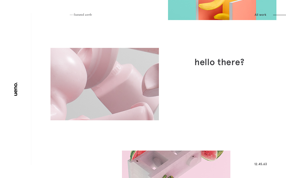
ueno — website and visual rebrand concepts.
First up is Ben Mingo’s rebranding concept for ueno, a design agency. His design embraces the playful vision that much of modern design is reaching for. The use of white space, small lettering, and little details like lines and rotated text is practically editorial. Also, font lovers will be quick to spy the usage of Aperçu, a neo-grotesque favorite.
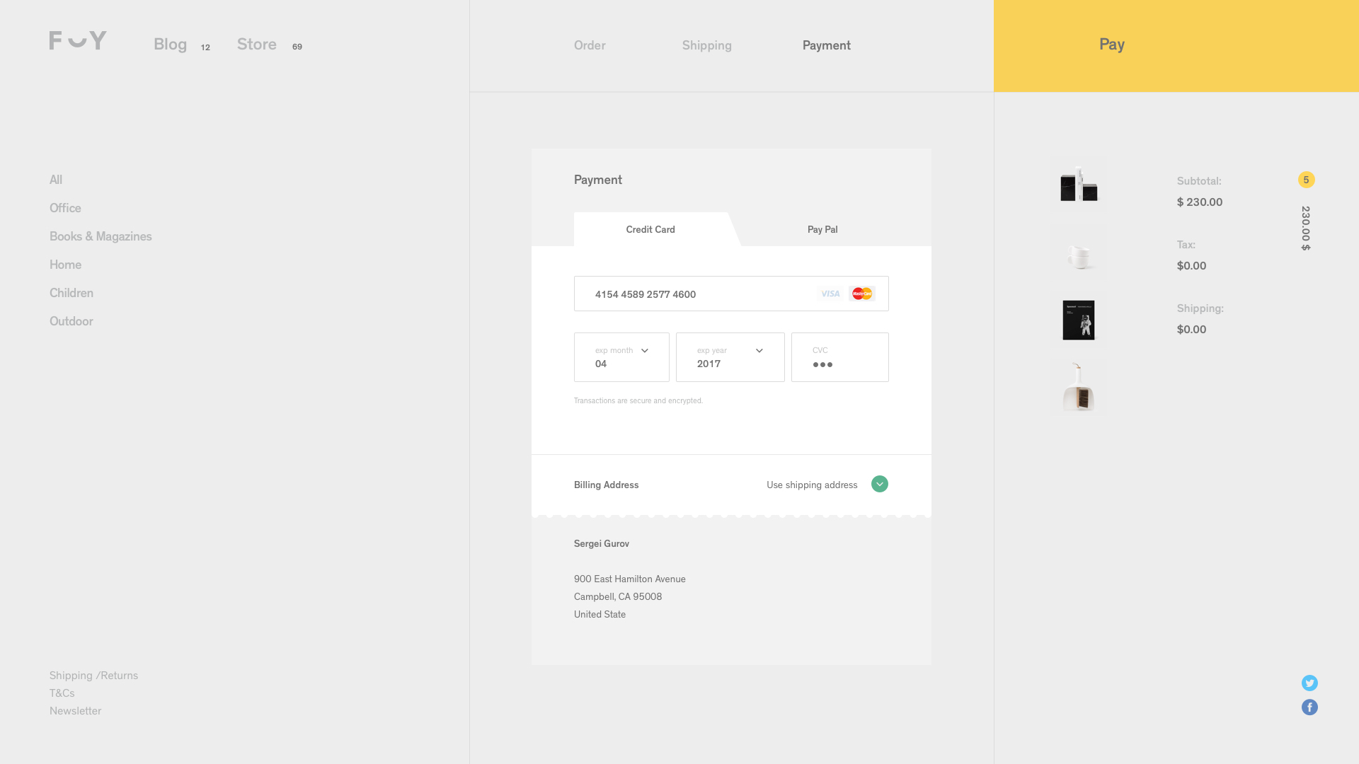
Next is Sergei Gurov’s website redesign for Formerly Yes, a home decor store based in LA. He uses a warm and unique color palette, almost entirely ditching the contrast of black and white for inviting yet sophisticated colors. What is particularly pretty is the page for the shopping bag, with neat greys, a pop of yellow, and angled and scalloped shapes.
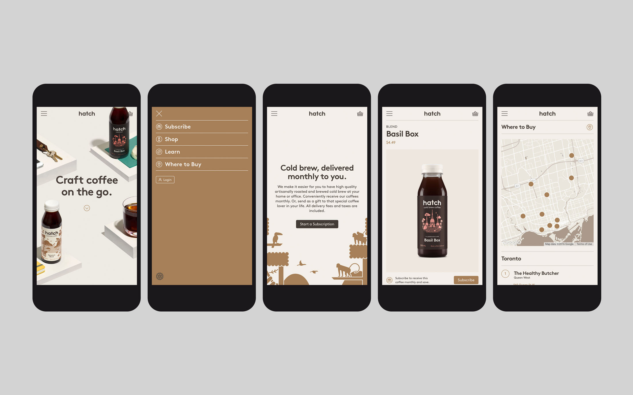
Hatch Cold Brew Coffee Identity, Packaging & Website
Chocolate-y colors, beautiful art, and neat information is exactly the sort of thing you would want from your coffee. In steps Tung :-P’s branding and design for Hatch cold brew coffee. Our favorite part of the website is the “Learn” page, which utilizes large .gifs and an adapted color scheme. The packaging of the actual coffee is equally exciting: the illustrations for each drink are individual but still recognizably related, and carry the story of the brand through.
Diana Dubina’s rebranding for madburg, an event agency in Russia, takes hold of strong colors and whimsical imagery to create a fantastical experience. Featured are a mix of nebulous transitions, plenty of white space, and Alice in Wonderland imagery. If there ever was a need to convince designers to use animations playfully, this would make a strong argument.
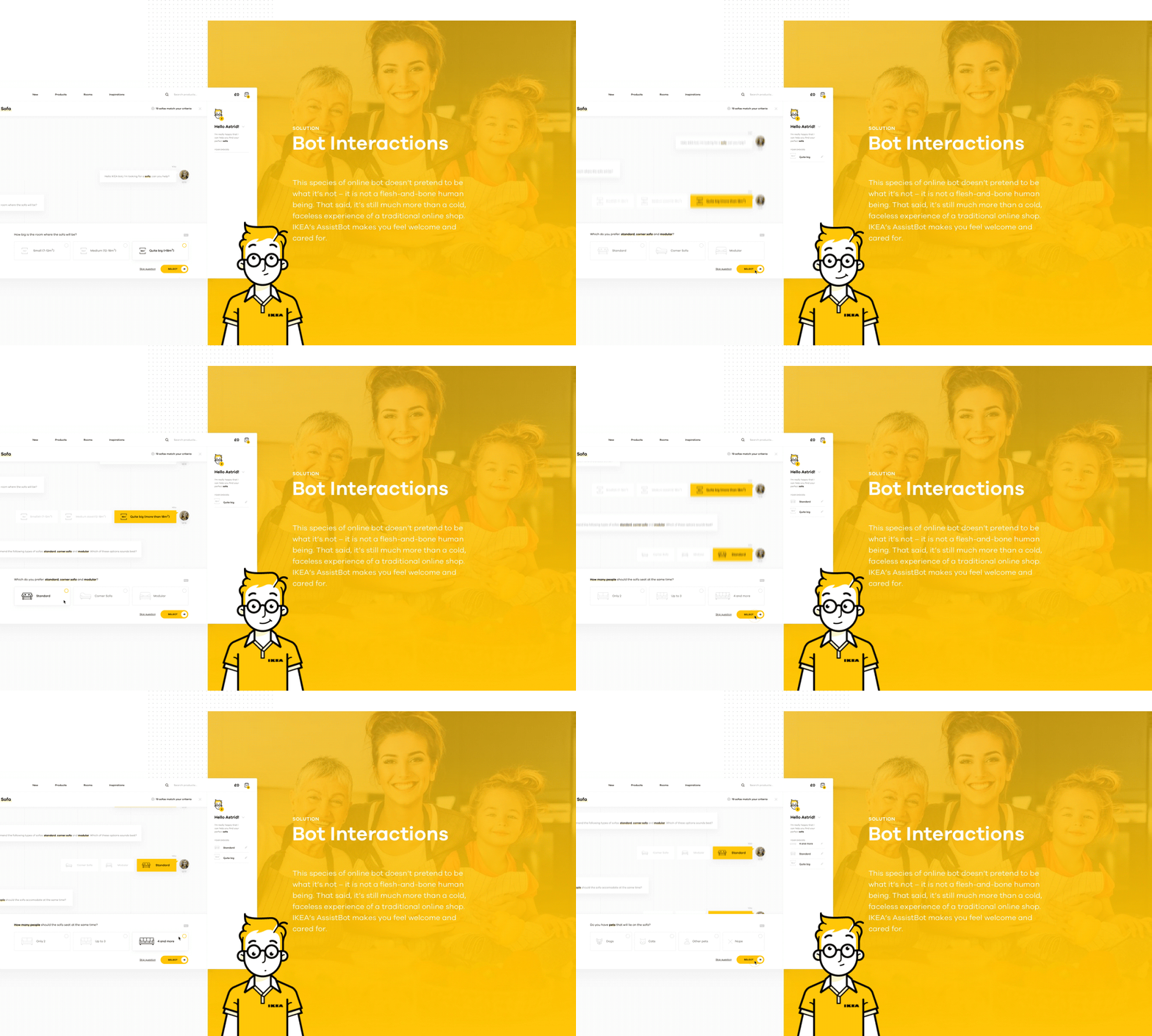
Shopping made personal – IKEA online experience concept
Netguru presents a concept for IKEA that does more than present items to users easier, it showcases them beautifully. The yellow accents are on the right side of quirky and gives more life to an already colorful Bot – whose name is Stephen, by the by. The design of the conversation box mimics the visuals of texting with a friend. As is the continuing trend, this design allows “empty” space to highlight and frame that which is “full”.
Like what you’ve seen? Comment below to let us know some of your favorites.




Leave a Reply
Want to join the discussion?Feel free to contribute!